Design System Foundations
Summary
While working for our client we noticed that there was a lack of cohesion across the serval applications and teams. Seeing this inconsistency, we were able to align with project managers and key shareholder to give them a solution that would make it easier for teams to align on brand, design language and development.
Research
Our biggest challenge was to understand how each department viewed and utilized their existing components and designs. Seeing that there was more than five departments that would need to be considered, we wanted to find what was being used currently in their applications. We accomplised this by doing an inventory audit with the major platforms to give us a better understanding of what was being used.
We defined the approach by Brad Frost to be our best solution moving forward. He suggests that “Interface Inventory should start with a simple task of taking a lot of screenshots of the UI and categorizing them into chunks in a keynote presentation.”
- Elements — the smallest individual pieces of the interface which act as building blocks for components (e.g. buttons, form fields…)
- Components — independent and repeatedly used pieces of the interface built out of elements (e.g. toolbar item, page loader)
- Modules – full functionalities built out of components (e.g. toolbar, search)
- Layout Definitions – All of the above use core files (such as variables, icon font definitions etc.) to unify styling.
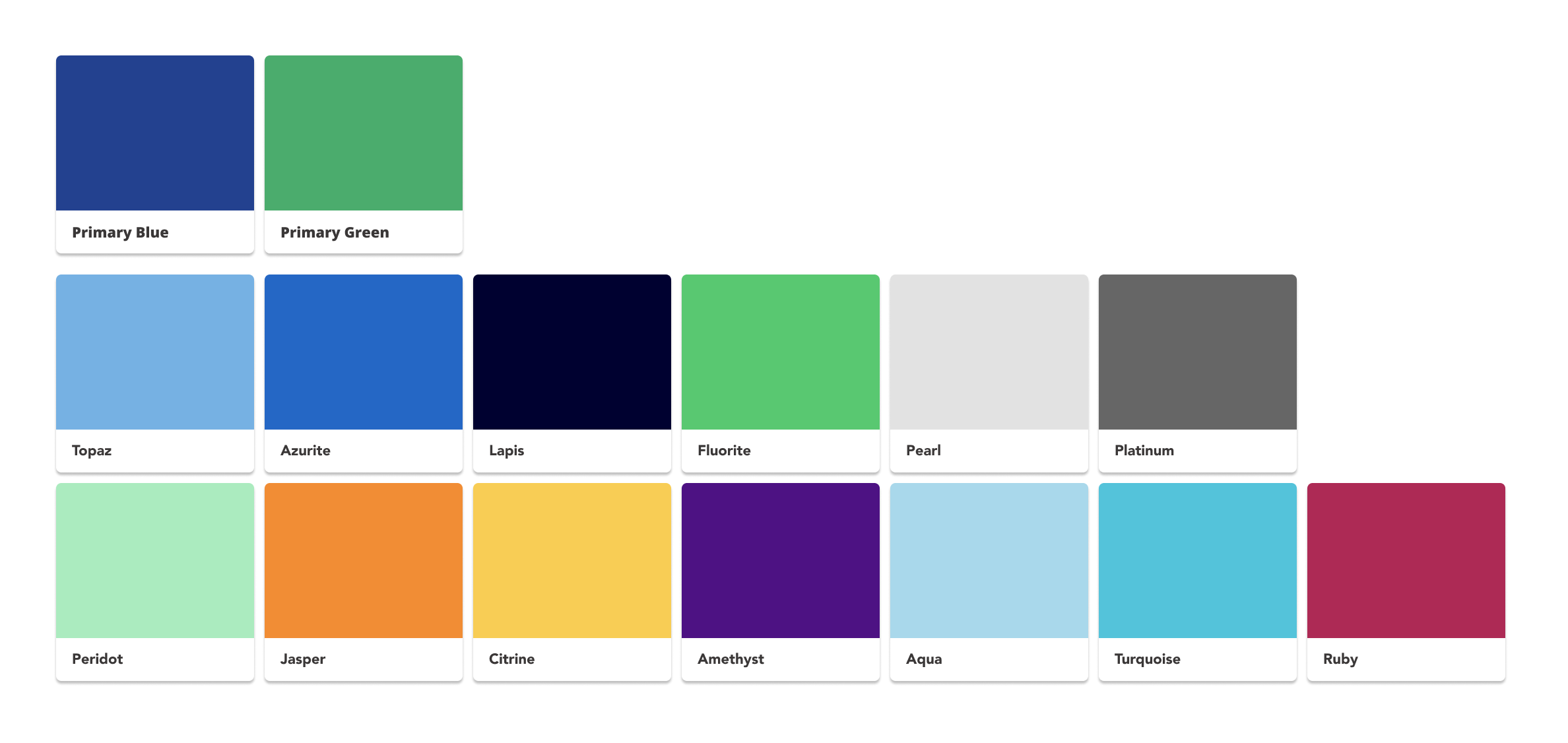
We documented our finding in Sketch for a better visual indication on the irregutlatires across platforms. We used the document to compare the different elements, components and any design assists. Using that same document, we then grouped all similar elements together allowing use more visibility into where we can make improvements. After this process was complete, it gave our team a better understand on the areas where we could make a big impact on how our end users see the brand.
As we worked on the inventory audit, we began interviewing designers, developers, project managers and shareholders. We set out with one goal in mind, “How can we help the business define more creative solutions while limiting development time during sprints?”
Learning and understanding each development and design process across platforms was a major key to our success since each platform worked slightly different from the first. This gave us more insight into the pain point and concerns most developers and designers were having.
Design Approach
Color
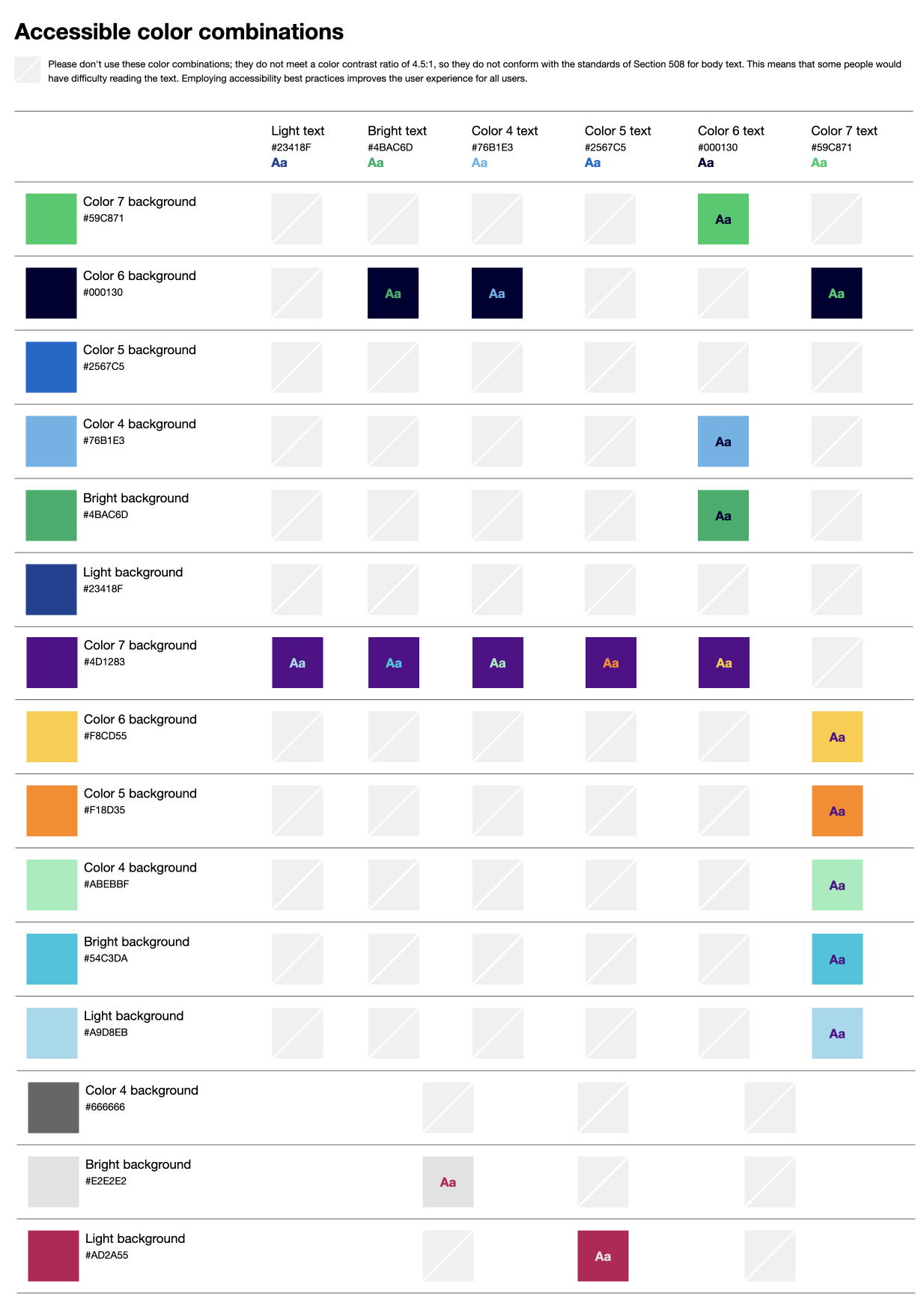
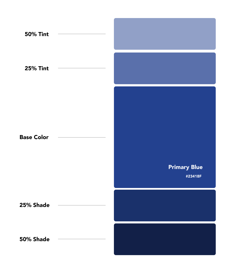
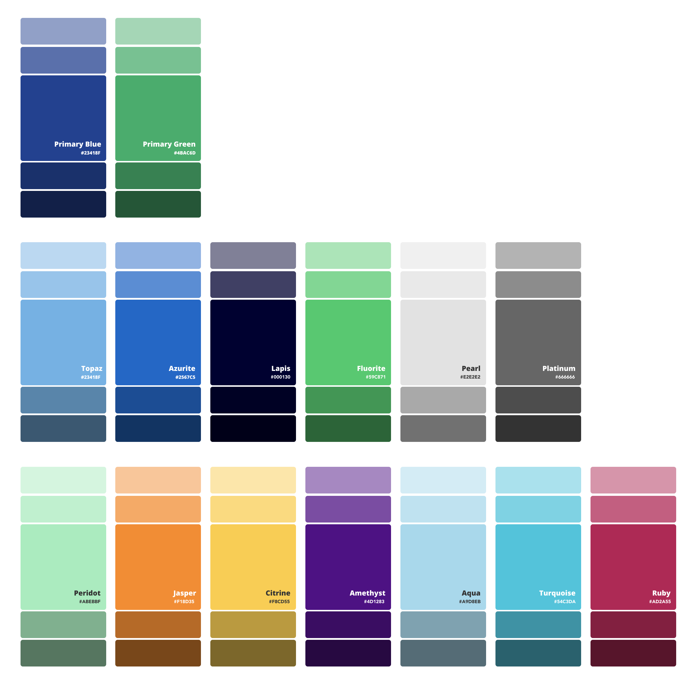
Now that we had all the components documented, we set out to define how those were being created. We started this process by looking at the brand color palette. Since we already had the palette, we needed to ensure that each color would have an accessible counter part. Our process here was simple, we took each main color, added two shades and two tints then tested those new variations against a color analyzer tool. The tool we went with was the W3C Color Analyzer. Having a wide range of color variations made sure that we would adhere to WCAG 2.0 Guidelines and our site would be accessible to all users.
                $color-primary-yellow: #FFE66D;
                $color-primary-teal: #4ECDC4;
                $color-primary-teal-a11y: #0b7f9a;
                $color-primary-dark-gray: #292F36;
                $color-primary-blue: #1C77C3;
                $color-neutral-white: #fff;
                $color-neutral-gray-02: #F7F7F7;
                $color-neutral-gray-07: #eee;
                $color-neutral-gray-13: #ddd;
                $color-neutral-gray-27: #bbb;
                $color-neutral-gray-50: #808080;
                $color-neutral-gray-60: #666;
                $color-neutral-gray-73: #444;
                $color-neutral-gray-93: #131313;
                $color-neutral-black: #000;
              $color-neutral-white: #fff;
              $color-neutral-gray-02: #F7F7F7;
              $color-neutral-gray-07: #eee;
              $color-neutral-gray-13: #ddd;
              $color-neutral-gray-27: #bbb;
              $color-neutral-gray-50: #808080;
              $color-neutral-gray-60: #666;
              $color-neutral-gray-73: #444;
              $color-neutral-gray-93: #131313;
              $color-neutral-black: #000;
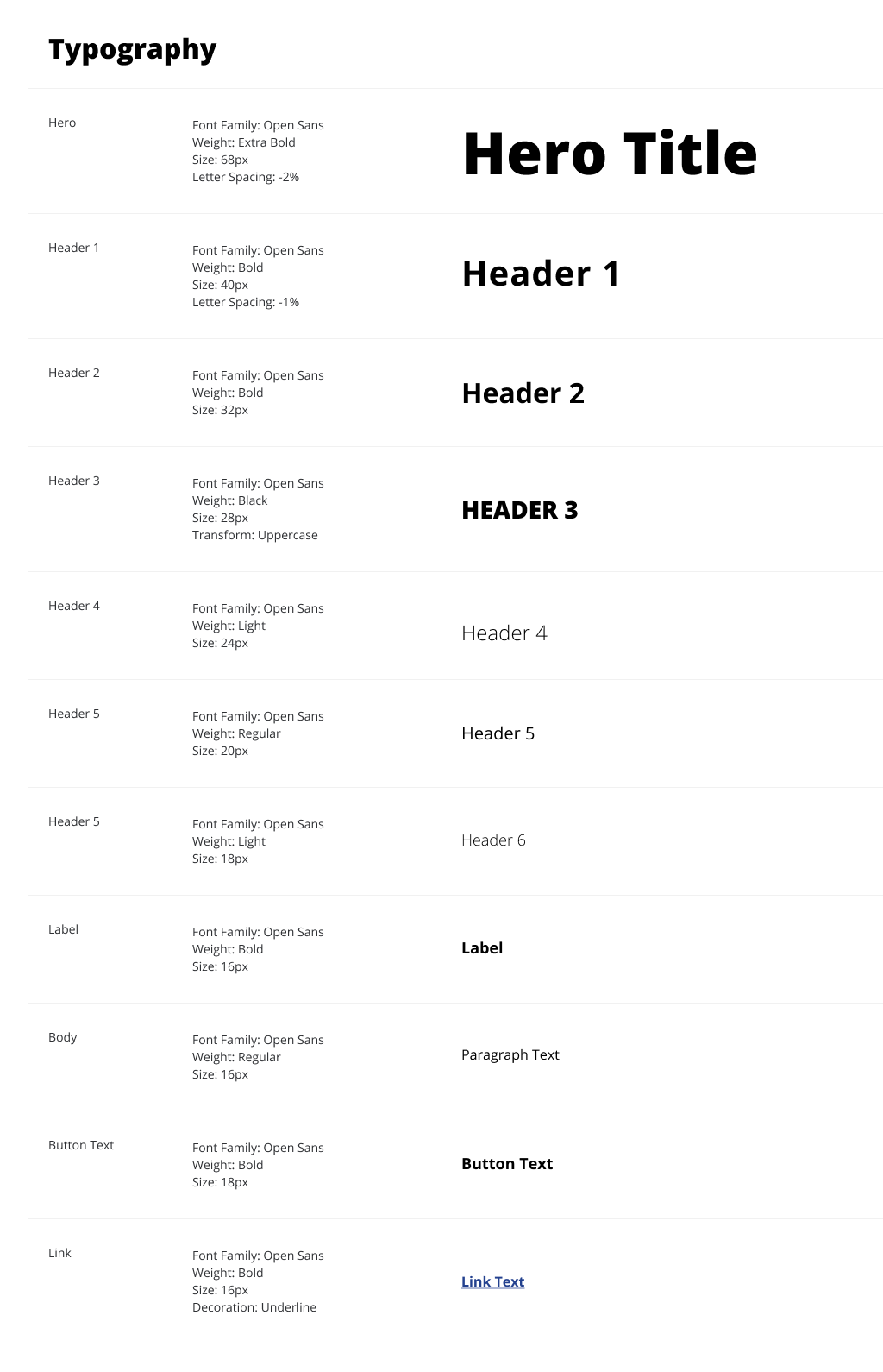
Typography
With our newly defined color variations, we need to look at typography. Using our sketch document to gather font sizes, styles and variations we had a baseline to use a reference. We needed to define what font family is being used, variations of that family and how you can use them in your project.
We wanted to make sure we had good hierarchy moving forward so we researched the best approach for this. After researching different methods, we landed on incorporating a modular scale to fit our needs. Using 16px and 18px as our base, we then used a minor-third to give us our desired typography scale. Having two base sizes allowed us to have more variation in how we displayed our font choices.
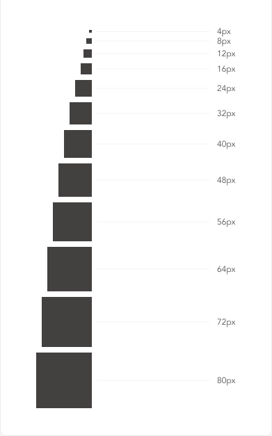
Spacing
Our final step was to set up a spacing system that allowed us to deliver consistent metrics across multiple platforms and screens. Knowing what was needed, we were set on using the 8-Pixel Grid System. This grid system allowed us to have a more consistent spacing for not only elements and comports but aided us in page layouts also.
During each step of the process we were defining new components and systems but documenting how and when to use them. Having this documentation allowed for the business to have a better understanding on the design and development process.
                  $spacing:        1rem;
                  $spacing-small:  round(0.5 * $spacing);
                  $spacing-large:  round(2 * $spacing);

                  $spacing-xxs    : round($spacing / 0.25);
                  $spacing-xs     : round($spacing / 0.5);
                  $spacing-sm     : round($spacing / 1.333);
                  $spacing-md     : round(1 * $spacing);
                  $spacing-lg     : round(1.5 * $spacing);
                  $spacing-xl     : round(2 * $spacing);
                  $spacing-xxl    : round(2.5 * $spacing);
Development
As we found better solutions for certain elements, we looked at how those were being created via HTML. We noticed as we did the audit, that many components didn’t adhere to the WCAG 2.0 Guidelines for accessibility. Knowing this we were able to build more robust, accessible components.
Conclusion
Giving our client a foundation to stand on in terms of a design system allowed product teams to take advantage of quicker sprints, faster QA turnarounds and an overall more cohesive brand.